Free Fundraising Flyer Templates to Use Now
The event is planned. The date is set. Now, all you need to do is spread the word about your nonprofit organization’s latest and soon-to-be greatest fundraiser! Whether you’re going the traditional print route or choosing a social media campaign strategy, you can’t go wrong with an eye-grabbing flyer.
From tri-folds to single-pagers, we here at Fundraising Brick offer free fundraising flyer templates to our valued clients, so you can grab the attention of potential donors right away. Best of all, if you don’t have experience with Adobe InDesign or Photoshop, don’t worry. Our templates are designed in such a way that it’s easy to create attractive flyers from them, even if graphic design isn’t your passion.
Why Use Our Event Flyer Templates?
We understand that your donors crave personalization; that’s why our templates and ordering forms allow you to customize everything.
We offer:
- One-page, bi-fold, and tri-fold fundraiser flyer designs
- Completely customizable images and text
- Countless font options
- Optional, pre-written standard text
- Print or PDF options
Each order form will contain the following key portions:
- Donor contact information
- Pricing information and payment options
- Brick lettering and sizing options
- Donor inscription (up to 6 lines of text with up to 20 characters per line)
- Optional clipart entry
5 Charity Fundraising Flyer Template Examples
Inspiration and creativity go hand-in-hand when you choose Fundraising Brick for your next fundraiser. Don’t just take our word for it, though; check out what some of our previous clients have created using our free design templates.
Be inspired with these fundraiser flyer ideas. Then, contact us for more information on how we can work together to kickstart your next fundraising event!
Example 1
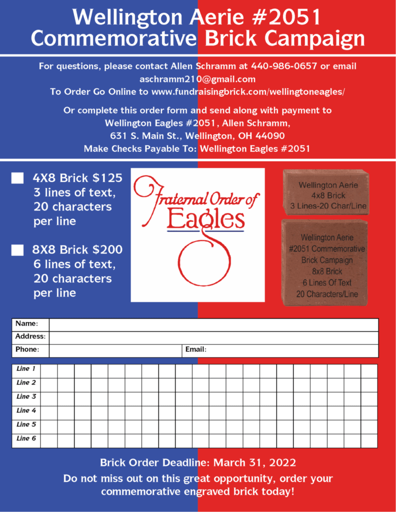
Wellington Aerie #2051 opted for a simple-yet-effective one-page design. Right away, the bold two-color design draws the eye; potential donors can’t help but notice it. Everything potential donors need to know–from pricing to contact information–is written clearly and concisely as well. This example proves that sometimes less is more when it comes to effective flyer design!
Example 2
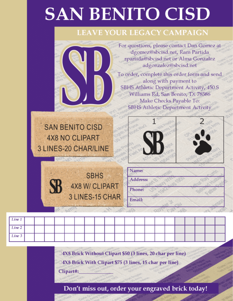
San Benito CISD’s one-page flyer uses complementary colors to immediately grab readers’ attention. It then keeps that attention with an easy-to-read layout that walks donors through every step of the ordering process. It’s hard to ask for much more from any fundraising poster.
Example 3
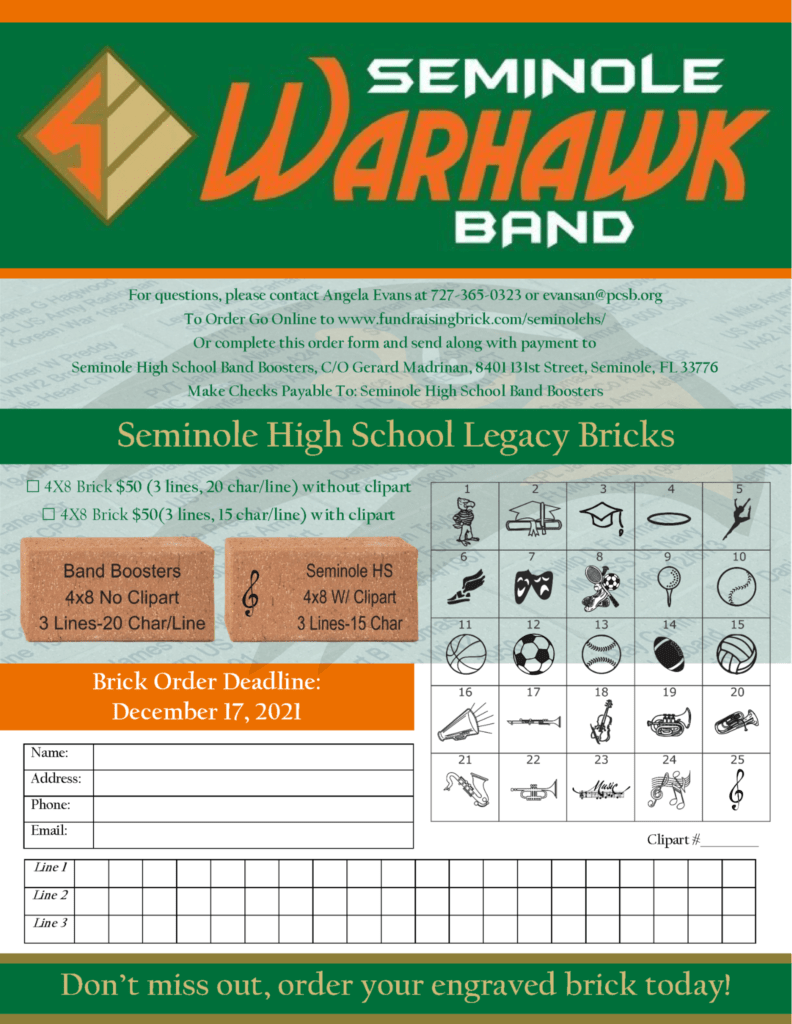
Seminole Warhawk Band’s donation flyer hits all the right notes: a noticeable header, attractive colors, catchy calls-to-action, an easy-to-read layout, and eye-grabbing graphics.
Example 4
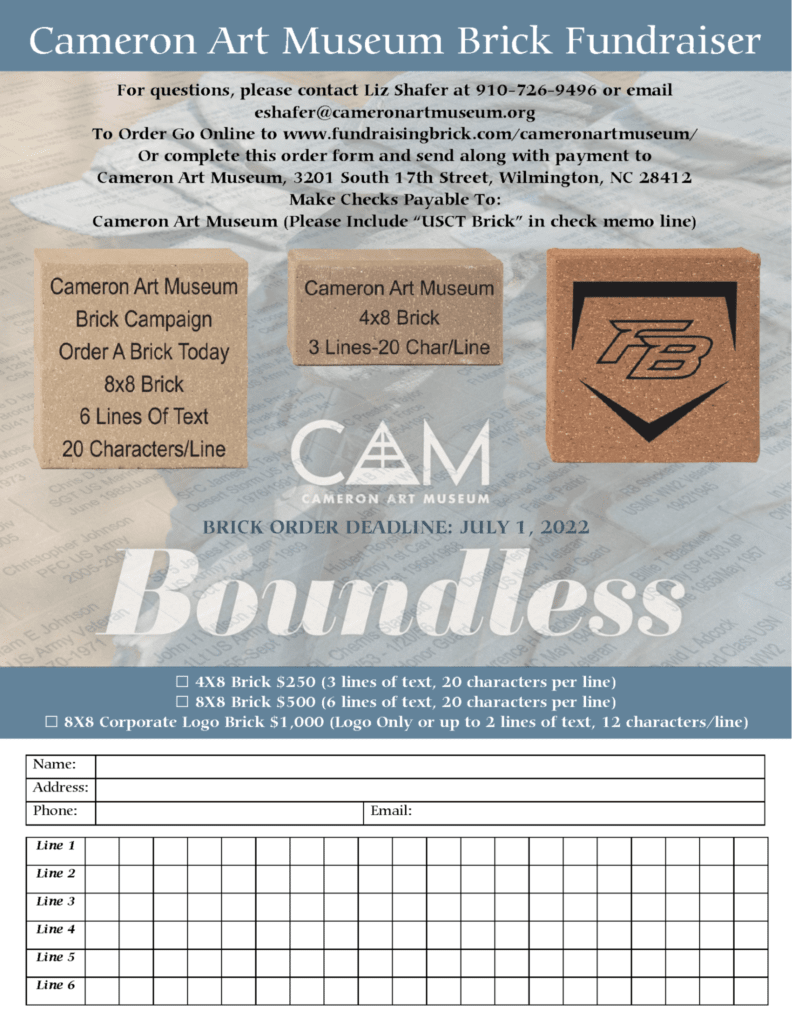
Cameron Art Museum’s flyer offers donors the option for either 3 lines of text, 6 lines of text, or a corporate logo. Displaying examples of each option gives donors an idea of what their specially engraved brick would look like; the more likely someone is to visualize their brick, the more likely it is that someone will actually want to sponsor one!
Example 5
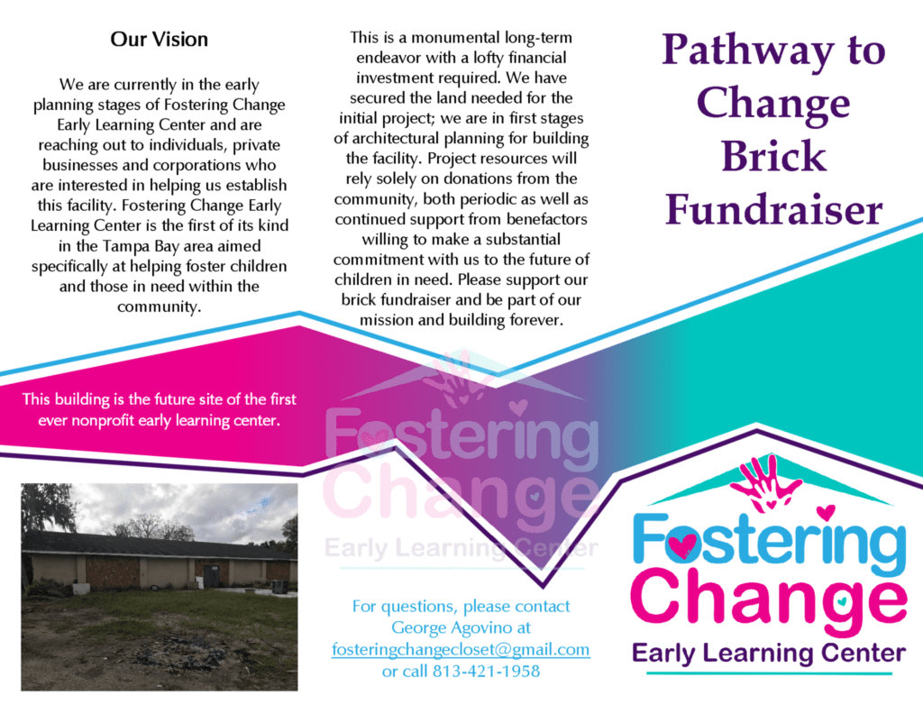
A one-page layout for a charity event flyer might appear cluttered if you have a lot to say to your audience. Instead, follow Fostering Change Early Learning Center’s lead and opt for a sleek tri-fold format. This format gives you the freedom to detail your organization’s fundraising goals and give potential donors extra information about their brick options–all without making the flyer seem crowded.
Receive Your Free Templates Now
To receive free printable fundraiser flyer templates, just complete and submit the form below:
Download Our Free Fundraising Packet
We are here to help you start your next fundraiser, whether it’s a small church raffle, school bake sale, or large NGO charity donation event. Request a free packet to receive the information you need at every stage of your fundraising campaign.

